Summarize this post with:
In this post, I will walk you through a Python Script that uses Plotly Library to visualize keyword performance based on clicks wherein X-Axis is the clicks cluster & Y-Axis is where the keywords are.
Things you Need:
You will need a GSC Export from G Sheets Search Analytics for Sheets containing keywords, clicks, impressions & CTR. Apart from that you will need the Python Script.
Here is the Python Script
					import pandas as pd
import plotly.express as px

# Read the CSV file from GSC
df = pd.read_csv('clicks_cluster.csv')
df['clicks'] = df['clicks'].str.replace(',', '').astype(int)

# Group the data by clusters based on clicks
df['clicks_cluster'] = pd.cut(df['clicks'], bins=[0, 100, 1000, 10000],
                              labels=['low', 'medium', 'high'])

# Create the Plotly bubble chart
fig = px.scatter(df, x='clicks', y='keywords', color='clicks_cluster',
                 hover_data=['clicks_cluster', 'clicks', 'impressions', 'ctr', 'keywords'])

# Save the chart as an HTML file with CSS & JS embedded
fig.write_html('bubble_chart.html', include_plotlyjs='cdn', full_html=False)
How does the output work?
The script in replit creates an HTML File that you can download & open in a browser tab to see the visualization.

This is how the overall visualization looks like. As you can see in the right side, there are three clusters.
- high
- medium
- low
The entire visualization is segregated among these.
Plotly Allows you to see selected (multi-select also available) clusters at a time with a zoom-in option.
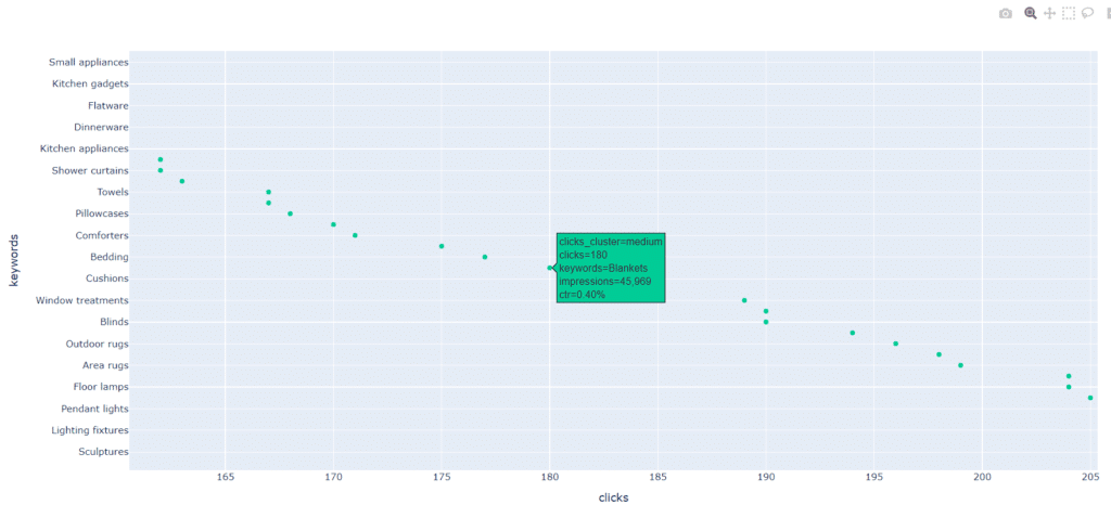
More than that as you hover over the markers you can see the keyword that belongs to which cluster, what are the clicks, impressions & CTR.

As you can see in the above screenshot we are visualizing only the medium clicks keyword cluster here.

In this screenshot, you can see how we can zoom in on specific markers to specifically visualize those only. And see we hover over a marker we can see the clicks cluster it belongs to, what the keyword is, impressions & also the CTR to understand the performance of the keyword even better.
What is the use case of using the visualization?
This visualization is good for gaining a bird eye view of the Non-Brand keywords the site has, and which cluster they are belonging to.
The keywords that you will identify in medium & low clusters with poor CTR & high search impressions are the ones that need help going up.
More than that you can modify this script to add two more columns on the CSV that you will import.
search volume, exact ranking from the rank tracker
Doing this will offer you much more granularity.
Another use case is to use this while building the SEO Audit to visualize a new brand’s keyword cluster & gaining a bird eye view over it,

Kunjal Chawhan founder of Decode Digital Market, a Digital Marketer by profession, and a Digital Marketing Niche Blogger by passion, here to share my knowledge


good information