

Summarize this post with:
I know you have come here to know about 9 ways to increase conversion of your blog in 2021?
I guarantee you that by the end of this article you’ll get the secret tips to increase conversion rate. So, now let’s start
Do you know what the average conversions of a website is?
It is 2%. This means that if 100 people come to your website only two of them buy the product you promote.
Also, this 2% conversion is on the higher side but many of the websites have only 0.1 to 0.2%.
It means out of 1000 people 1 or 2 of them will become your customer.
Here is a demographic from wordstream showing the average conversion rates of google adwords for different topics.

You can see the highest conversion is 3.30% for the products of climate control.
However, if you want to increase your earning even if you are not getting much traffic then you can do it with the help of CRO.
CRO stands for conversion rate optimisation these are some techniques which can help you get more conversion.
In this article you’ll get 9 super ways to increase CRO of your blog.
However, if you are a newbie and doesn’t have hosting and website then here are 10 best affordable hosting providers.
So let’s get started.
Now this is one of the never old ways of getting higher conversions.
I am saying this because affiliate marketers are widely using it to increase their conversions from a long time.
You can make these kinds of forms from the pop up maker which is a WordPress plugin.
Now, the main topic for discussion is how you can make your visitor add their email to the pop up form.

This can be done with the help of lead magnet method which is used for ads especially FB ads.
To understand this let’s take an example that you have a computer tips and tricks website where you want to increase conversions.
You have added an exit pop up to your website however, people coming to your website are not filling it.
It is because they are not getting something for sharing their email or phone number with you.
And to add that something which visitor of your website will get is lead magnet.
For the computer tips and tricks website you can make a cheat sheet explaining parts of the computer.
How to make a computer or problems and solutions of the major computer problems.
Just you have to put your mind and make a lead magnet according to your niche.
This tip is applicable for the contact as well as pop up lead generation form.
Removing unnecessary forms means that for example if you have made a lead generation form in which you have to fill email, mobile number, name, class etc.
It would take a lot of time for the visitor to fill the form which would increase the friction to fill the form.
Friction means the resistance that one surface encounters while moving over the other one.
Even the marketing guru, Neil Patel says that same thing.

You should know the AIDA model to fully understand the importance of less forms in forms.
For example you go to some marketing website and see that they are giving a SEO checklist as their lead magnet to fill their form.
You gave some attention to the form. It is the first step of this model.
Then if the form has more fields then it would take more friction for you to fill that form and you may lose interest in the free SEO checklist.
So, to maintain that interest you should have less fields.
Also, in order to fill the form you should also have the need or desire of that SEO checklist.
If you don’t have the need for that why would you take it.
Then, at last you go further and take action in the form of filling your email address in the pop up or contact form.
So, if you like this AIDA model then do share this article with your friends as well.
So, if you want to increase conversion just use a simple email lead generation form with no other field included.
Now, you might ask me if I also want the phone number of the visitor as well? What can you do?
If you want the phone number or any other info of the visitor you can send emails to them hoping the user would fill in other details as well.
Or you can make OTO lead (One time offer) pages in order to get other details from the visitor.
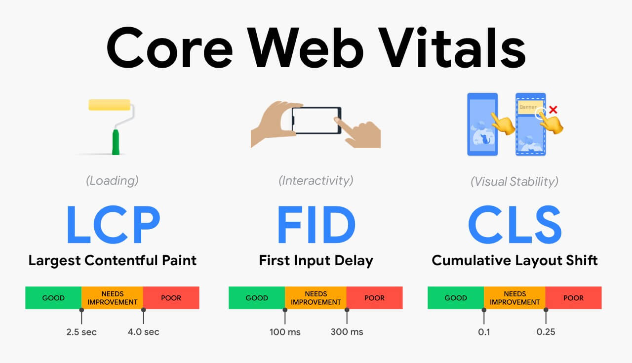
This tip is super important if you want to increase conversions as well as rank higher on google in 2021.
You might know that now CLS (cumulative layout shift) from the web vital plays a great role in ranking websites on google.
And if you will allow different annoying elements on your website such as ads or a lot of forms.
Then it will increase the CLS or whole web vitals of your website that results in bad user experience.
The landing page should be clear, easily navigational and without any annoying elements.
Here are the things which your landing page should have:
- Headline and subheadings.
- Benefits, features, pros and cons.
- Testimonials and reviews.
- Visual elements according to topic.
With that you can also add a single pop up form, live chatbot etc.
Also, you can use the tools like Crazy egg to have the heat maps of your landing page.
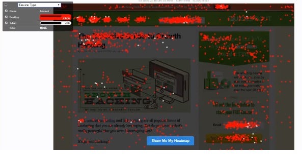
It tells you how users are interacting with your landing page and where they are clicking on your webpage.
If you are tight on budget then you can use the heatmap.com for making heat maps for free.
It is one of the best techniques for sales by creating a brand symbol in the minds of the readers.

Let’s understand with the help of examples that think of Facebook what color comes to your mind. It is blue. Isn’t it.
Think of YouTube which color comes to your mind. It is red.
Now, people trust these brands due to their single color theme.
So, if you are writing a review article then keep in mind always try to write in a similar color theme.
So, that people would have trust in you, it would create a brand of you and also increase conversions as well.
First you have to decide the consistent color theme for your website and then you use colorzilla to pick the color code of that color.

Nishant Nanda is a blogger and affiliate marketer who writes mainly about blogging, SEO and affiliate marketing on his website lightworldwide.com. There he provides only actionable on his blog.
Hello Nishant,
Thank you so much for putting together this amazing post.
I believe that it’s always better to do A/B testing by putting the Opt-in form at different places on the site or blog.
Also, setting up a session recording tool will help you understand user behavior and interaction with the opt-in box placements.
For me, till now, the best places to put optin-box to get more conversions are:
– A Optin-box area on the homepage (Hero Section or Below hero Section)
– On Your Blog Listing Page
– On Your Blog Sidebar
– On Your About Us Page
– At the end of your content on the blog post page
– In the footer widget area
– PopUps & Exit-Intent Popup (As You have mentioned to brother)
Thank you for sharing these amazing tips.
Regards,
Romy Singh
Thank you so much for an informative post. I have a question, How many pop-ups are enough without being annoying to the customers??
I would say just one that too if needed because you can’t ignore the SEO disadvantages that come with using too many pop-ups. Like horrible page speed for instance